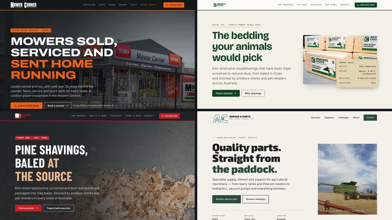
Zack Design has rebuilt four Australian client sites for 2026 — Mower Corner, AC Service & Parts, Breeder’s Choice and Superior Shavings — and the last two went live this week. The two bedding sites each carried a single monolithic Jekyll layout, 1,843 and 1,380 lines, loading Bootstrap 5.3.3, jQuery 3.7.1 and a Font Awesome kit from five CDN hosts before rendering a word. They now run 443 lines of hand-written CSS each on Jekyll 4.4.1 and GitHub Pages, and none of the four loads a CSS framework any more.
This post walks through what the rebuild actually consists of: the line counts before and after; the stockist finder that still reads the owner’s Dropbox CSV at page load and the two-pass state matcher that recovered 74 of 407 retailers a strict regex was dropping; the four things that made it safe to ship an unapproved redesign to /preview/ on the client’s live domain; a Liquid filter chain that doubled a URL; and the <details> menu, Intl.DateTimeFormat readout and reduced-motion reveal on Mower Corner.
This post replaces three older ones about the same clients. Those described sites that no longer exist, and described them in the language of a brochure. This is what got built.
What was there before
Breeder’s Choice’s old _layouts/default.html pulled, in order: a Font Awesome kit from kit.fontawesome.com, Bootstrap 5.3.3 CSS from jsDelivr, AOS 2.3.1 from unpkg, and at line 1233 jQuery 3.7.1 from code.jquery.com, Bootstrap’s bundle from jsDelivr again, jQuery CSV 1.0.40 from cdnjs, and AOS’s script from unpkg. Superior Shavings had the same Font Awesome kit, the same Bootstrap and jQuery, jQuery CSV from jsDelivr, and Montserrat from Google Fonts — no AOS, which I had misremembered until I read the blob. Five CDN hosts each, a different five. Mower Corner’s externals were in _includes/styles.html and _includes/scripts.html: Bootstrap 5.3.2, Font Awesome 6.4.2 from cdnjs, AOS from unpkg, Oswald and Open Sans from Google Fonts, and every photo from Cloudinary.
None of that was unreasonable in 2015. It is just that the whole budget of every page went to generic scaffolding, and what came out looked like every other Bootstrap site, because it was one.
What replaced it, verified with wc -l:
| CSS | JS | Source pages | |
|---|---|---|---|
| Mower Corner | 1,132 lines, main.css |
210 lines, site.js |
5 |
| Breeder’s Choice | 443 lines | 228 lines (site.js 52 + stockists.js 176) |
10 + a 404 |
| Superior Shavings | 443 lines | 228 lines (same two files, byte-identical) | 10 + a 404 |
AC Service & Parts is a one-page site whose 698 lines of CSS are inline in _layouts/home.html; it had a full redesign in April and a refinement pass in August, below. Google Fonts and Analytics still load on all four, and Mower Corner still serves its imagery through Cloudinary, because the 2017 shop photography is flat and underexposed and e_improve:outdoor plus e_auto_color on the actual pixels beats any CSS filter. I am not going to claim a purity I did not ship.
Four businesses, four registers
The temptation with four clients at once is one design system in four colourways. These are four trades in two states, and two are sister brands owned by the same person, which makes differentiating them the actual design problem.
Mower Corner — “spec plate.” Their mark is a condensed wordmark standing in a strip of grass, unchanged since the 90s, and it is genuine equity in Colac. The grass stayed and was redrawn as a silhouette; the sky gradient and clip-art operators did not. The structural device is the riveted spec plate off the side of every machine in the shop, carrying the shop’s own data. main.css declares --ink: #14181a (cast iron), --orange: #f2600c (safety orange, the equity colour), --grass: #2b7134 (the traced green from the wordmark’s grass strip), and --radius: 2px; /* pressed metal, not soft plastic */.
Breeder’s Choice — “the bale and the spec.” A family business that has done one thing since 1994. A 14 kg bale with a moisture spec is a real product, so the product leads: their own pallet photography, and a kraft bale-label tag carrying the spec the way the printed wrap does. --forest: #0B4423 and --green: #0F6B36 from the logo, on cream and kraft, --radius: 6px; /* softer than the industrial sibling */. The stylesheet header calls it “the daylight sibling of Superior Shavings’ iron-dark industrial register.”
Superior Shavings — “mill-side.” The sister plant, in NSW softwood country, where the pitch is proximity: from the saw into the bale with minimal handling. So it got the opposite register: --iron: #1F2224, the logo’s --red: #BF2025, a numbered mill line, the spec set as a mono bale ticket. Same structure as Breeder’s Choice, same ethos, different plant. Each site links the other from the story section (“In NSW? Meet Superior Shavings”), the footer, and a Brand node in the JSON-LD.
AC Service & Parts — refine, not replace. The paddock palette and harvest photography were already working, so the budget went to what a review found: terracotta text on bone was 3.1:1, and moving it to --terracotta-dark gave 4.7:1 on bone — and then failed on --paper and --bone-dim, so the token darkened again from #A8562F to #9A4E2A for 4.5:1 on every ground. Search Console had flagged 30 “Either offers, review, or aggregateRating should be specified” errors, because each catalogue <li> was typed as a schema.org Product with only a name and image; the Contentful model has no price or SKU, so those could never validate, and the catalogue is now an OfferCatalog on the LocalBusiness node. The two Unsplash heroes were self-hosted, the desktop nav lost an aria-hidden="true" that had been hiding it from screen readers, “no middlemen” was dropped because SpareX is a distributor, and a second, ungated gtag block at the end of <body> was removed before it could double-count.
The stockist finder belongs to the client
Breeder’s Choice and Superior Shavings are sold through produce stores, saddleries and pet retailers: 407 and 540 of them, counted from the live CSVs today. The owner maintains both lists in his own Dropbox, and has for years.
The obvious engineering move is to pull the CSV at build time: it server-renders, it’s fast, it’s cacheable. I built it the other way on purpose, and the header of stockists.js says so:
/* Stockist finder — fully dynamic by design.
   The CSV lives in the owner's Dropbox and is fetched in the browser at page
   load, so edits go live with NO site deploy. Do not move this to build time.
   No jQuery, no jquery-csv: ~40 lines of native fetch + parse. */
A build-time fetch means his edits do not appear until something triggers a deploy, and the moment his workflow depends on my CI, I have taken his list away from him. He edits a spreadsheet; the site updates. The URL reaches the script as data-csv="{{ site.stockists_csv }}", the parser is 23 lines and handles quoted fields and embedded commas, and if the fetch fails the page says so and shows the phone number.
The state matching is where the real bug was. The first version was one regex, \b(NSW|VIC|QLD|SA|WA|TAS|NT|ACT)\b, against the address fields. The review pass counted what it dropped: 74 of Breeder’s Choice’s 407 rows, and Victoria went from 185 stockists to 258 once they were recovered. The live CSVs mix VIC, Vic and Victoria, and a strict parse silently loses those rows. So it is two passes:
  function stateOf(s) {
    var hay = (s['Address 2'] || '') + ' ' + (s['Address 1'] || '');
    var m = hay.match(/\b(NSW|VIC|QLD|SA|WA|TAS|NT|ACT)\b/);
    if (m) return m[1];
    m = hay.match(/\b(new south wales|victoria|queensland|south australia|western australia|tasmania|northern territory|australian capital territory|nsw|vic|qld|sa|wa|tas|nt|act)\b/i);
    if (!m) return '';
    var t = m[1].toLowerCase();
    return STATE_NAMES[t] || t.toUpperCase();
  }
That is not defensive programming for its own sake; it is the difference between a stockist appearing and a stockist not existing.
The list renders as indexable HTML across nine pages per site — stockists/index.md plus act, nsw, nt, qld, sa, tas, vic and wa — with the Google map as an enhancement on top. The previous implementation drew everything into a map and nothing else, which meant several hundred Australian retail locations were invisible to search.
Shipping a redesign onto a live domain nobody has approved yet
This is the part I would reuse anywhere.
Both bedding sites belong to one owner, and a redesign he has not seen cannot go live — but a preview he has to take my word for is not a preview either. Staging on a .github.io URL means he reviews something that behaves differently from the real thing: different domain, different certificate, no CNAME, no analytics.
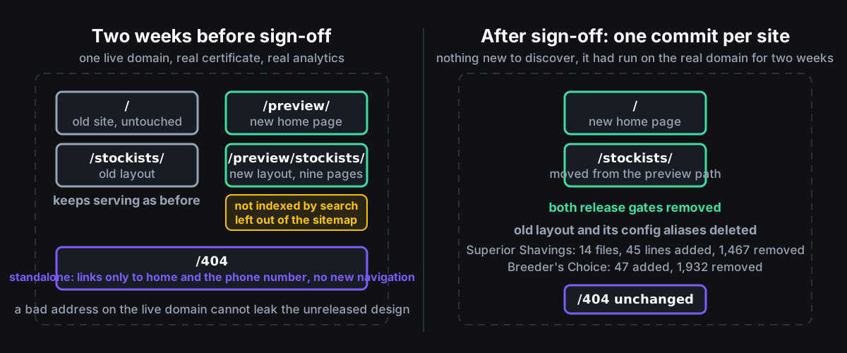
So the new design shipped to his own live domain at /preview/ on 7 August, two weeks before he approved it, while the old site kept serving / untouched.
Four things made that safe:
- Every preview page carried two release gates in front matter.
noindex: trueandsitemap: false, on the home page and all nine stockist pages, so Google never saw a half-approved site or a duplicate of the live one. The og:image default was scoped topath: "preview"for the same reason: the old pages at/had to stay byte-identical. - The old layout stayed the default by doing nothing. There is no
defaults:layout in_config.yml. The rootindex.mdkeptlayout: default; every new page underpreview/opted intolayout: homeorlayout: stockistsexplicitly. - Config keys were deliberately duplicated. The old layout read
stockistscsvandphone_international, and jekyll-seo-tag appendedsite.taglineto the live homepage<title>. So the new templates readstockists_csv,phone_intlandbrand_tagline, and both sets lived in_config.yml, each commented with which layout owned it. The comment on the alias reads “the OLD layout still serving at / reads this key. Remove when the preview is promoted.” It was added in its own commit, after the review pass found the live stockists page had lost its CSV. - The 404 page was rebuilt standalone,
layout: null, its own markup and inline CSS, linking only home and the phone number. The CSS comment says why: “this page serves on the LIVE domain today, so it carries no nav into the unreleased design and no links that 404.” An earlier version inherited the redesign’s header, which meant any bad URL on the live domain leaked the unreleased site.
One Liquid bug is worth recording because it looks correct. The header built the stockists link as:
{%- assign stk = page.stockists_index | default: home | append: 'stockists/' -%}
Filters are a left-to-right pipeline, not a conditional. default: only substitutes when the left side is falsy, but append: runs regardless — so on a preview page where page.stockists_index was already /preview/stockists/, the link became /preview/stockists/stockists/. The fix is an explicit unless.
The flip itself, once he signed off, was mechanical: git mv preview/stockists/* stockists/, repoint home_url and stockists_index, drop the two gates, delete _layouts/default.html and the aliases only it read. One commit per site: 14 files, 45 insertions, 1,467 deletions on Superior Shavings; 47 and 1,932 on Breeder’s Choice. The design had been running on the real domain for two weeks, so there was nothing to discover at go-live.
Two things I learned from GitHub Pages in the same fortnight. It caches assets for four hours, which twice in one day left browsers running stale JS after a deploy; every asset URL on the bedding sites now carries ?v={{ site.time | date: '%s' }}. And the Pages action injects a base_path that silently breaks every asset URL if the custom-domain setting is ever dropped, so the workflow pins jekyll build --baseurl "". Google Analytics is emitted only when jekyll.environment == "production", which the workflow sets; a dev build has zero gtag loads, production exactly one.
Mower Corner, specifically
Mower Corner went live on 6 August and got the most functional work, because a shop has state a bedding manufacturer does not.
The header carries a live readout — “Open now · until 5pm”, or “Closed · opens tomorrow 9am” — computed in the shop’s timezone, not the visitor’s, so someone checking from interstate sees whether Colac is open right now. The hours live once, in _config.yml, and drive the schema.org openingHoursSpecification, the printed plate and the readout; the layout serialises them to window.MC_HOURS with jsonify. The JS uses Intl.DateTimeFormat('en-AU', { timeZone: 'Australia/Melbourne', … }).formatToParts(), normalises the hour with % 24 because en-AU can render midnight as 24, strips the weekday to three letters because CLDR data varies, and wraps the whole thing in try — formatToParts with an explicit timeZone can throw on old engines, and a status readout is never worth a blank page. It refreshes every 60 s.
Four service pages were written against local search demand rather than invented: chainsaw-service-sharpening, mower-servicing-repairs, spare-parts and pickup-and-delivery. A pickup process I had drafted was removed the same day in a commit titled “remove the pickup process I invented, keep only what’s sourced”. The range picked up STIHL’s iMOW robotic mowers, and Click & Collect is branded STIHL-only throughout, because the online-order pipeline is STIHL’s and implying you could get a Victa through it would generate exactly the wrong phone calls. site.webmanifest went from display: standalone to browser, because a brochure site for a local shop has no business prompting Chrome to install itself.
Two implementation notes I would defend anywhere:
- The mobile menu is a
<details>disclosure. It opens and closes with no JavaScript.mobileMenu()is 28 lines and only adds Escape (returning focus to the<summary>), outside-click, closing on same-page anchors, and closing when the(min-width: 62rem)query flips to desktop — so a script failure degrades to a working menu rather than a hamburger that does nothing. - Reveal-on-scroll replaced AOS with an
IntersectionObserveratthreshold: 0.1, staggered byMath.min(i % 4, 3) * 70ms. It checksprefers-reduced-motionfirst and, if the visitor has asked for less motion or the browser lacks the API, marks everything visible. The hiding styles are armed bydocument.documentElement.classList.add('js')from the script itself, not the document head: if the file never loads, nothing is ever hidden.
The rebuild commit records two multi-agent review rounds over the code and 43 confirmed findings fixed, from ink-on-orange ::selection at 5.4:1 to a duplicate canonical. What I would take from the four together: put the client’s data where the client already edits it, count what a regex drops before trusting it, and stage on the real domain behind noindex rather than on a lookalike. No Lighthouse numbers were recorded, so I am not quoting any.